


Hillary Clinton's infamous campaign logo was created by a three-person team of designers who were invited to work on the "secret" design project four months before the official campaign launch in April 2015, according to a recently published essay written by the lead designers.
Michael Bierut's essay, "I'm With Her: What I learned designing a logo for Hillary Clinton," was published in the Design Observer. It chronicles the timeline of his involvement with Clinton's campaign—from the excitement of learning that his logo was chosen, to the heartbreak of Clinton's electoral defeat, and further to his decision to wear the logo at the January "Women's March" in Washington, D.C.
It all began in January 2015, when Bierut was "invited to volunteer" his services for what he saw as Clinton's "historic moment."
"I was invited to volunteer my services on a secret project: the design of a logo for the possible presidential bid of the former First Lady and Secretary of State Hillary Rodham Clinton," Bierut wrote. "This was a historic moment. I said yes immediately."
Although critics would later point out the simplicity of Bierut's final design—a blue "H" containing a rightward facing red arrow—a lot of thought went in to creating it, according to the essay.
"I put together a three-person team: me, designer Jesse Reed, and project manager Julia Lemle," Bierut wrote. "We would work in secret for the next two months."
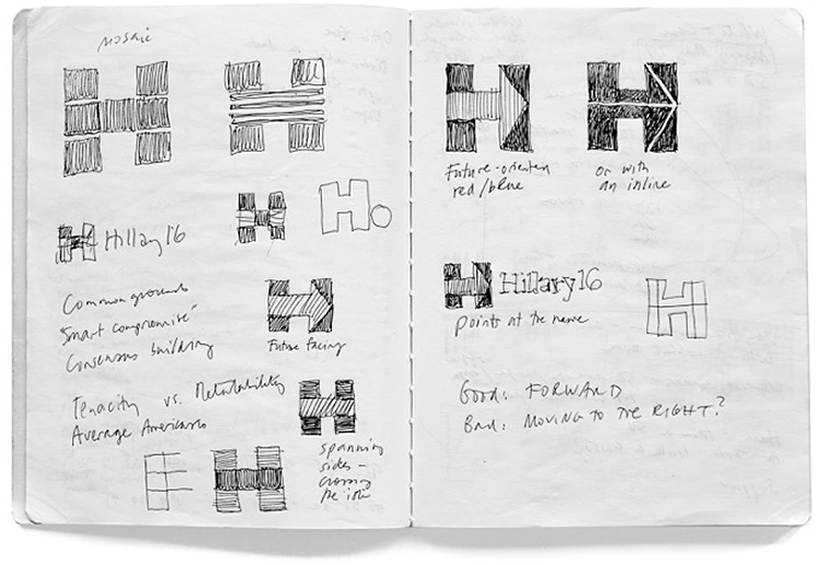
Bierut says the goal of the two-month secret project was "to create something new and different." The team settled on "a perfectly square H," which seemed simple but really was anything but.
"Although we explored dozens of symbols, the one everyone gravitated to was the simplest of all: a perfectly square H," Bierut explained. "But its simplicity was deceptive. What looked like an H was really a window, capable of endless transformations."
By adding in an arrow, the logo was complete.
"We worried that the H alone, even as an ever-changing frame, was too static. We finally found what we thought was the right finishing touch, the simplest thing in the world: an arrow, emerging naturally from the geometry of the letterform, pointing forward, toward the future."
Sketches made by Bierut in January, which he included in his essay, show that his team considered numerous variations on the "H." The sketches also show that he was aware that it was odd for the Democratic candidate's logo to include a large red arrow pointing to the right.
Bierut then was given the opportunity to pitch the logo directly to Clinton, who he found to be "brilliant," "genuine," and "one of the best listeners" he had ever met.
He didn't know his logo had been chosen by Clinton, however, until he saw it in Clinton's official launch video in April.
"What we had been working on in secret was suddenly public," Bierut wrote. "It was really happening."
The majority of the reviews were negative, which was difficult for Bierut to deal with, but he was told by the campaign to "adopt a no-comment policy about the logo."
Though he was unable to defend the logo publicly, he believes that "the world noticed" how great it actually was as the campaign went on and its versatility became known.
Bierut also thought that Donald Trump's visual campaign was awful—"Bad typography; amateurish design; haphazard, inconsistent, downright ugly communications"—and that gave him added confidence as he settled into the Clinton campaign's election night victory party in New York City.
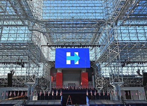
"It was going to be the most thrilling night of my life," Bierut wrote. "As I walked the darkening streets of midtown Manhattan toward Jacob Javits Convention Center, from blocks away I could glimpse an enormous image on the JumboTron over its main entrance, a forward-pointing arrow superimposed on a letter H."
The night, of course, did not go as planned.
"Going home, with my necktie with its pattern of H logos loosened around my neck, embarrassed by my hubris and worried about the future of our nation, I tried to figure out what had gone wrong," Bierut wrote.
Despite the loss, however, Bierut says he still believes in both Clinton and his abilities as a logo-creator.
"I still believe in Hillary Clinton, and I am prouder than ever of the work we did for the campaign," he wrote.
Bierut concludes that his "power of design" is now more important than ever.
"We are in uncharted territory now, and it is at once frightening and exhilarating," he explains.
"Frightening because we face extraordinary challenges," he wrote. "Exhilarating because I believe, more than ever, in the power of design."
"It can provide comfort in the face of devastating change, and it can shake us out of our complacency when action is demanded. And now, more than ever, at the moment we need it most, it belongs to all of us."


