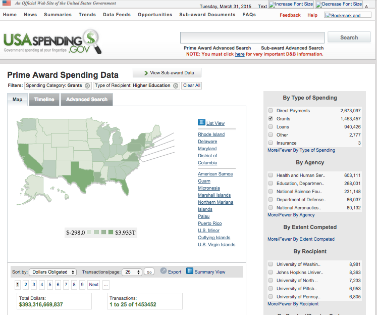
A redesign of a transparency website that provides information on federal spending by the Obama administration now makes it much more difficult to see how taxpayer dollars are spent.
Usaspending.gov, a website mandated by law to provide detailed information on every federal contract over $3,000, received a makeover on Tuesday. Users can no longer search federal spending by keywords, sort contracts by date, or easily find detailed information on awards, which are delivered in bulk.
Information, such as how much the Pentagon spends on Viagra, used to be available at the click of a button. Locating those same contracts on the new website is virtually impossible, akin to finding a needle in a haystack.
In its previous form, the website provided easy access to how taxpayer dollars are spent, as it happens. A user now must have the federal grant identification number to see details of a contract.

In another aspect of the overhaul, the online address of each of the website’s individual pages now begins with the word "transparency."
The new version of Usaspending.gov provides a "spending map" to search by zip code, and "agency profiles," which only provide totals of funding, sub-awards, and transactions. The results list the highest dollar amounts by company, but provide no links to specific contracts.
The list of agencies does not include smaller government bodies such as the National Endowment for the Arts (NEA), but does include the "Barry Goldwater Scholarship and Excellence in Education Foundation." Results for the profile of "Other Small Agencies" returns zero grants or contracts, with the reply "no data found."
The public can search by recipient, though those results are also limited. A user must click on every contract to find a short description of what the spending involves.
The new website also does not allow users to search multiple years simultaneously.
"If you select more than one Fiscal Year, you will only be able to select one Spending Type," the website says. "You can only select a maximum of three Fiscal Years at a time."
A user can download federal spending data by agency. However, those results—in either Extensible Markup Language (XML) or spreadsheet form—return vast amounts of convoluted data.
Those files are also separated by prime awards, sub-awards, contracts, grants, loans, and "other financial assistance" categories, making it necessary for users to download multiple large files when searching for all agency spending that used to be available at the click of a button.


An advanced search allows a user to see all of an agency’s spending, separated by contract type, though the results are only available alphabetically. A user cannot sort the data by date, making it impossible to see agency spending day to day. One can download the results to sort by date in a spreadsheet, but they include no description of what the contracts are for.
Downloading data on spending by the State Department nearly crashed this reporter’s computer.
Search results are also not indexed on Google, making the website’s search engine the only avenue for citizens and reporters to find information within the site. Microsoft Sharepoint operates the new website’s search, and the results are limited.
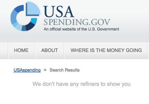
For example, a search of "contracts" returned zero results.

The Federal Funding Accountability and Transparency Act of 2006 required the creation of a website that provided "full disclosure to the public of all entities or organizations receiving federal funds beginning in Fiscal Year (FY) 2007." The website became Usaspending.gov.
"The purpose of the act is to provide the public with information about how their tax dollars are spent in greater detail in order to build public trust in government and credibility in the professionals who use these dollars," according to an explanation of the website from the Department of Education.
The website is also designed to "encourage openness and communication about effectiveness," to "make more data and information available to the public," and to "increase the transparency of the grant application and award process."
The Bush administration law mandated a "single searchable website, accessible by the public for free."
The website must also include the following information on each award of federal spending: "The name of the entity receiving the award; the amount of the award; information on the award including transaction type, funding agency, etc.; the location of the entity receiving the award; and a unique identifier of the entity receiving the award."
The redesign of the website makes this information much more difficult to locate.
Users reacted negatively to the website’s change on Twitter.
"Wow, the USAspending.gov redesign is not good," wrote one user. "Basic search is broken, advanced search forces you to use multiple variables..."
Wow, the http://t.co/4zE96T9VxD redesign is not good. Basic search is broken, advanced search forces you to use multiple variables... (1/?)
— Sam Rosen-Amy (@rosenamy) March 31, 2015
"Feds really screwed up USASpending.gov with redesign," said another. "Less functionality, more constraints, less data (FY2008 now earliest)."
Feds really screwed up http://t.co/S9ie8zzyze with redesign. Less functionality, more constraints, less data (FY2008 now earliest)
— Bill Allison (@bill_allison) March 31, 2015
Another user noted that there is now less access to information.
"[In case you missed it] ICYMI USAspending.gov has been redesigned to show far less detailed procurement data," they said. "‘Improvements’ brought to [you] by the FedGov."
ICYMI http://t.co/D8c6Y670bj has been redesigned to show far less detailed procurement data. "Improvements" brought to u by the FedGov.
— Alex Rossino (@govwinfiaalex) March 31, 2015
The website was not perfect prior to its reboot. The Government Accountability Office (GAO) found that Usaspending.gov was missing billions of dollars in federal awards, and the vast majority of federal contracts included errors.
The federal government had purchased the website back from the contractor running Usaspending.gov, Global Computer Enterprises, Inc. last October. GCE, which had operated the website since 2003, declared bankruptcy last year.
The website was previously overseen by the Office of Management and Budget, before the Treasury Department’s Bureau of the Fiscal Service took it over in January.
The bureau was tasked with "making improvements to the site's usability, presentation, and search functionalities" for its re-launch, which went live on Tuesday.
Requests for comment from the Bureau of the Fiscal Service’s office of public affairs were not returned.
"This is the most transparent administration in history," President Barack Obama declared in February 2013, arguing that information on laws and regulations were "put online for everyone to see."
