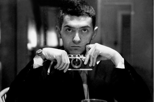
There are a couple of fascinating supercuts below the jump showing the fastidiousness of directors Stanley Kubrick and Wes Anderson. A few thoughts after the videos.
Kubrick // One-Point Perspective from kogonada on Vimeo.
Wes Anderson // Centered from kogonada on Vimeo.
It's worth noting how similar these two aesthetics are: The camera is focused on the center of the screen and symmetry is used to an almost disconcerting effect. The goal is extremely different, however. Whereas Anderson is crafting a series of still lifes stitched together to create a film, Kubrick is conveying motion and movement, depth of space. Even when the camera is not relentlessly pushing forward—tracking a character on trike or in a trench, careening into the infinite or carousing through an orgy—we get a sense of space. Anderson's compositions, by comparison, are rather flat. He treats the screen like a canvas, painstakingly positioning everything just so in order to create his desired tableau.
In the age of hyper kinetic "chaos cinema" and distractingly wielded shaky cams, these two montages are a handy reminder of the power of precision. It can be offputting—I half-believe that people who claim that they "don't get" Kubrick are simply unnerved by his stylistic trappings; constantly centering the action is a bold choice and not frequently done—but the effect is striking.
